In the 2025/2026 season, interior design is dominated by colors that combine aesthetics with emotion, nature with modernity, and harmony with expression. Key color trends reflect society's needs for peace, stability, and bold identity expression in interiors. Increasingly, color becomes a tool for communication and mood building – not just a decorative addition.
The Color of the Year 2025 – Mocha Mousse – embodies elegance, naturalness, and balance, and its warm, subdued character fits perfectly with the growing importance of conscious space design. We also observe a strong return of earth tones, deep blues, mustard accents, and pastel tones, which, combined with appropriate materials and textures, allow for creating cohesive, comfortable, and functional interiors.
Today's focus is not only on colors, but also on their context, symbolism, and application method – from total looks and color drenching techniques to contrasting combinations and biophilic design. Contemporary interior color schemes are not a trend – they're a thoughtful response to the changing world and users' lifestyles.
Color of the Year 2025 – Mocha Mousse and its Application
Mocha Mousse is the Color of the Year 2025, which has gained designers' recognition thanks to its versatility, warm character, and timeless elegance. This deep shade of beige with a hint of milk chocolate combines naturalness with sophistication, introducing an atmosphere of peace, comfort, and coziness to interiors.
Mocha Mousse as a Symbol of Elegance and Peace
Mocha Mousse perfectly fits the need to create spaces that promote quietude and regeneration. The neutral yet saturated color subtly warms the interior without overwhelming it with intensity. It's a shade that works well both as a main color theme and as a background for more expressive accents. In color psychology, Mocha Mousse is associated with security, balance, and grounding – it's a response to the need for stability in times full of changes.
Combinations of Mocha Mousse with Metallic Accents
One of the most interesting trends in the 2025/2026 season is combining warm beiges with metals in brushed or satin finishes. Mocha Mousse beautifully harmonizes with brass, aged gold, or matte copper, creating sophisticated but not excessive interiors. Such combinations work perfectly in living rooms, dining rooms, and bathrooms, where not only aesthetics matter but also the effect of "soft luxury."
Mocha Mousse can also be combined with other neutral colors – like ivory, caramel, or deep graphite – creating monochromatic yet dynamic arrangements. Such a color palette works well in both modern minimalism and more classic, cozy spaces.
Dominant Color Trends
In the upcoming season, the interior color palette focuses around nature, warmth, and a sustainable approach to aesthetics. Earth tones, deep blues, bottle green, and pastel and neutral colors dominate, enabling the creation of both minimalist and more eclectic arrangements.
Earth Colors – Beiges, Browns, and Terracotta in Modern Interiors
Colors inspired by natural landscape – sandy beiges, clay browns, cinnamon, caramel, and terracotta – bring warmth and organic cohesion to spaces. They compose perfectly with raw wood, linen, or ceramics. This is a palette that works particularly well in living rooms and kitchens, where a cozy atmosphere counts.
Bottle Green and its Role in Arrangements
Bottle green returns as an elegant counterpoint to beiges and grays. It's associated with luxury while also with nature – it works in spaces that should build an impression of calm, depth, and maturity. Green walls combined with light wood or golden accessories create a sophisticated but friendly aesthetic.
Pastel Shades for Optical Space Enlargement
Pastel colors like powder pink, off-white blue, or sage green play a key role in arranging small apartments. They brighten the interior, optically enlarge it, and add lightness. Their subtlety allows for creative combining with stronger accents without oversaturation effect.
Neutral Colors as a Timeless Base
Neutral color schemes – whites, grays, sandy shades – never go out of style. They serve as a background for accessories that can be changed seasonally. This type of base works particularly well in apartments furnished from scratch. If you plan to create a functional and timeless arrangement, it's worth familiarizing yourself with a practical guide: How to Furnish a New Apartment – Tips for Beginners.
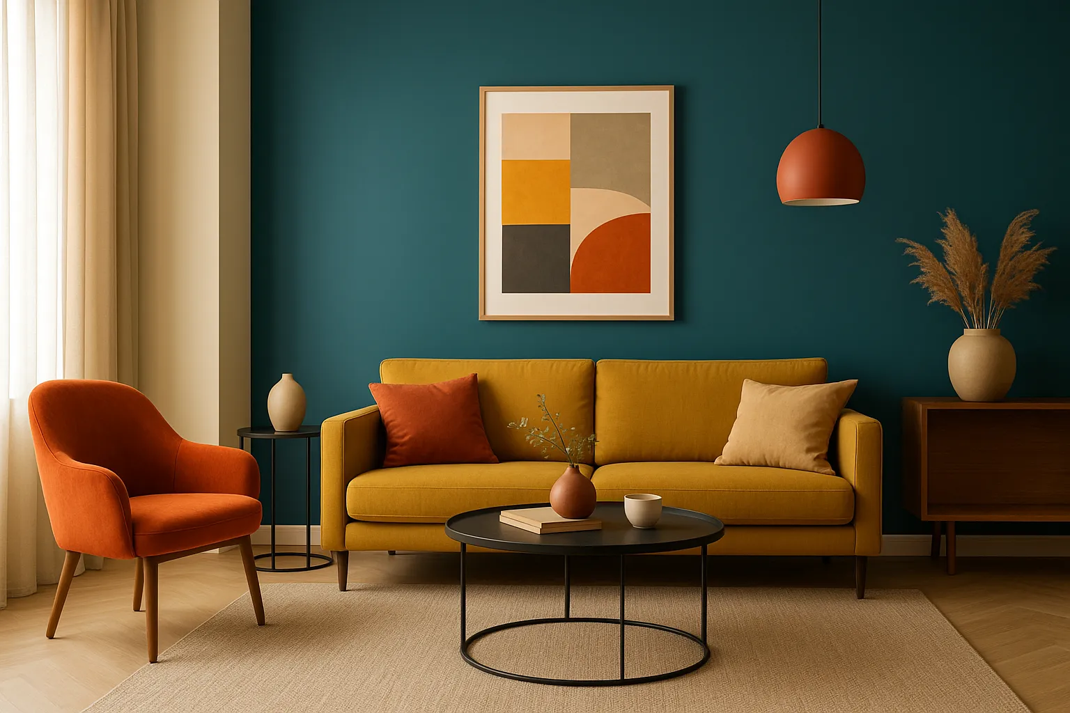
Mustard Yellow and Other Energetic Accents
Mustard yellow, rusty orange, or brick red are shades that break neutrality and introduce energy to interiors. They most often appear in the form of upholstery, curtains, pillows, or paintings. Applied selectively, they give arrangements character without the risk of overwhelming the space.
Deep Shades – Navy, Plum Violet, and Cobalt Blue
Dark colors like navy, plum, or cobalt build an atmosphere of intimacy and sophistication. They look particularly impressive in bedrooms, libraries, and dining rooms where lighting can be precisely controlled. Combined with matte surfaces and metallic accessories, they create an impression of modern luxury.
Color-Based Arrangement Techniques
The modern approach to interior color schemes goes beyond choosing individual shades – it increasingly relies on thoughtful techniques that build cohesion, depth, and expressive character of arrangements. Color drenching, total look, or contrasting combinations are tools that allow conscious space shaping.
Color Drenching – One Color in Many Tones
Color drenching involves covering the entire interior – walls, ceilings, doors, and furniture – with variations of one color. The effect? Immersion in color that works soothingly while giving the space a distinctive identity. This technique works great in rooms with specific functions, e.g., in bedrooms where a uniform palette promotes relaxation.
Total Look – Color Cohesion of Walls, Ceilings, and Furniture
Similar in concept to color drenching, the total look technique emphasizes complete color cohesion but with greater freedom in textures and materials. Monochromatic arrangements in shades of beige, sand, or off-white optically enlarge space and create an impression of order. This approach is particularly liked in minimalist and japandi interiors.
Stylish Combinations and Color Contrasts
Contrast in color schemes doesn't have to be loud – the key is conscious combination of tones with different temperatures and saturation. Example? Warm mustard yellow and cool cobalt blue. Such a combination stimulates the senses and brings energy while remaining aesthetically balanced. It's important for one color to play a dominant role and the other an accenting one.
How to Combine Colors
Skillful color combining is the art of balance – between functionality, aesthetics, and residents' individual style. Color temperature, saturation, and proportions between dominant and supporting tones are of key importance. Proper color selection allows both optical space shaping and building the desired mood.
Harmony of Warm and Cool Tones
Combining warm colors (beiges, russets, olive greens) with cool ones (blues, grays, sage) gives the possibility of creating interiors that are simultaneously cozy and fresh. The key is proper balancing of these two temperatures – e.g., a warm terracotta sofa combined with blue curtains or wall accents can create a modern yet relaxing atmosphere.
This solution works great also in small apartments, where tone differentiation allows functional zone separation without losing stylistic cohesion. People furnishing their first apartment might benefit from an approach based on practical zone and color planning – to visually organize space and maintain an impression of lightness.
Contrasting Combinations – Mustard Yellow and Cobalt
Color contrasts add energy and modernity to interiors. One of the season's more distinct trends is combining bold tones, e.g., deep mustard yellow with cobalt blue or dark violet. Such combinations look best in accessories – pillows, curtains, paintings – where contrast builds character but doesn't overwhelm.
In the case of studio apartments or bachelor pads, the rule works well: contrast in details – harmony in background. A neutral base allows introducing seasonal color changes without expensive renovations.
Interior Style vs. Color Choice
Each interior style imposes specific color selection logic. In boho style, pastels and earth colors dominate, composed in a free way, often with natural elements like wood or linen. Minimalist style focuses on a uniform neutral palette, while maximalism allows texture, pattern, and saturated color clashes.
When designing space, it's worth remembering that colors are not just aesthetics – they're also a tool affecting daily functioning comfort. In cozy arrangements, subdued, enveloping shades work well – chosen to build a warm climate right from the apartment threshold.
How to Combine Colors – Practical Arrangement Guide
Combining colors in an apartment is one of the most important elements of successful arrangement. A well-chosen palette affects not only interior aesthetics but also its functionality, optical proportions, and residents' mood. Here are proven methods and examples of how to combine colors in small and large spaces, according to the latest interior design trends.
Harmony of Warm and Cool Tones – How to Achieve It?
A harmonious interior is one where colors don't compete with each other but complement each other. One of the simplest techniques is combining warm colors with cool ones. Example: a warm shade of sandy beige or caramel on a wall can be combined with cool gray in sofa upholstery or curtains.
In the living room, a combination of light wood (warm tone) with a gray sofa and sage-colored accessories works great.
In the kitchen, beige cabinet fronts can be enlivened with cool blue on tiles between cabinets.
In the bedroom, it's worth applying e.g., a clay pink wall and bedding in cool navy shade – it's a soft contrast, yet very stylish.
This approach also works when arranging a small apartment, where color temperature differentiation can help separate individual zones without introducing chaos.
Contrasting Combinations – Colors That Add Energy
If you want to add expressiveness to the interior, go for contrasting combinations. The key rule? One color should be dominant, the other accenting. Fashionable duets of the 2025/2026 season include:
mustard yellow + navy – perfect for modern living rooms or kitchens with islands,
brick red + olive green – great for dining rooms or work corners,
plum violet + off-white – a subdued but intriguing proposal for bedrooms.
It's worth remembering that contrast is best introduced in accessories: pillows, rugs, paintings, or ceramics. It's a safe way to visually enliven the interior without the risk of getting bored quickly.
Interior Style vs. Color Selection – Adapt Palette to Function
Colors should be adapted not only to taste but also to interior style and its purpose:
Minimalist style – neutral palette (white, light gray, graphite), possibly accent in black or cool blue.
Scandinavian style – light wood, off-whites, pastels, blues, and grays.
Boho style – muted roses, terracotta, beiges, khaki green – nature colors combined freely, often layered.
Industrial style – cool grays, deep black, rusty brown, brick, graphite.
Well-chosen color schemes support interior function – e.g., cool and subdued colors help calm down in the bedroom, while warm and lively ones (e.g., yellow, russet) work in the kitchen or dining room where we spend time actively.
Biophilic Design and Nature-Inspired Colors
Biophilic design, or nature-inspired design, is one of the strongest trends in interior arrangement in 2025. Its goal is creating spaces that support well-being and contact with nature – not only through plants but also through appropriate color schemes, lighting, and materials.
Nature Colors – How to Introduce Them to Interiors?
Biophilic interiors are dominated by colors occurring in nature – greens, browns, beiges, rusty reds, blues, and off-whites. It's worth drawing inspiration from specific landscapes:
Deciduous forests – olive green, moss, bark color, and dark earth,
Beaches and dunes – light sand, gentle blue shades, shell pink,
Mountains and rocks – grays, slates, muted navies.
Such a palette promotes creating calm, relaxing spaces that positively affect concentration and rest – that's why it works in bedrooms, work rooms, and bathrooms.
Arrangement Example: Interior Like Morning Forest Mist
Imagine a bedroom with a matte olive wall, linen bedding in ivory color, and light wood accents. Add natural light, fern pots, and the aromatic scent of cedar wood. This is biophilic design in practice – simple but full of nuances. Such an interior promotes regeneration, even in the city center.
Color as Support for Balance and Daily Comfort
Nature-inspired colors are not just fashion but real tools supporting daily functioning. Research has shown that the presence of natural colors in interiors reduces stress levels, improves concentration, and facilitates falling asleep.
In small apartments, biophilic can be realized through:
a wall in sage or light green shade,
natural fabrics – linen, cotton, wool,
accessories in wood, stone, and terracotta colors.
This approach is perfect for people furnishing cozy, functional interiors that should work soothingly and promote rest after an intense day.
Maximalism and Eclecticism – Intensity and Diversity
Maximalism is an approach that allows full personality expression through color, form, and texture. Interiors furnished in this style are full of energy, details, and contrasts – without fear of excess. However, concept coherence is important – everything can be diverse as long as it's connected by a common idea.
How to Use Colors in Maximalist Style?
In maximalism, there's no single dominant color – there are many, but they occur in thoughtful proportion. Example combination:
intense bottle green + mustard yellow + terracotta + blue,
base in neutral walls and floors, with all "play" happening in furniture, textiles, and art,
multilayering – patterned rugs, colorful curtains, books, and decorations.
This style is perfect for people who don't like minimalism and want the interior to live and tell a story.
Eclecticism – How to Combine Different Eras and Colors
Eclecticism is a style that allows combining modern sofas with retro dressers, industrial lamps with pastel walls, or classic patterns with ethnic accessories. The key to success is one common denominator – e.g., a leading color (green, red, cobalt) or chosen material (brass, wood, marble).
In practice:
pastel blue walls can be combined with a brick sofa and graphics inspired by the 60s,
introduce colorful, irregular tiles to a loft-style kitchen – as background for modern, simple fronts,
in the living room, combine a stylish vintage sofa with a modern coffee table and contemporary art – the whole cohesive thanks to repeating palette: e.g., muted turquoise + dirty white + russet.
This approach requires courage and intuition but gives enormous freedom. It works well in apartments with soul, where every object has its story.
Quiet Luxury – Subtlety and Neutrality
Quiet luxury is an aesthetic that doesn't need color loudness to make an impression. It's a style based on perfect quality, noble simplicity, and neutral color schemes – muted beiges, off-whites, warm grays, soft olive, and cool sandy.
How to Achieve "Quiet Luxury" Effect in Interior?
Focus on natural light and finish quality – wood, stone, wool.
Colors should be background for textures and proportions – e.g., gray wall with microcement effect, linen curtains, and graphite sofa.
Avoid intense accents – the whole should work subtly but elegantly.
Quiet luxury is a style that works particularly well in new apartments – it combines modernity with timeless taste. It can be easily supplemented with seasonal accessories without risk of losing style.
Boho Style and Pastel Accents
Boho is synonymous with freedom, softness, and slight nostalgia. A style that feels good in natural colors but isn't afraid to introduce color – especially pastel.
How to Use Pastels in Boho Style?
Walls in pistachio or sage color combined with light wood and wicker furniture.
Pastel curtains in peach shade, yellow pillows, linen fabrics – everything subdued but visually pleasant.
A rug with ethnic pattern in muted pink and blue colors is perfect for a boho living room, plus lots of plants in terracotta pots.
Boho style doesn't require perfection – quite the opposite. The more natural, imperfect textures and unexpected color combinations, the better. The interior should look like a "collection of memories" – but built with taste.
Materials and Textures Supporting Color Schemes
Color in interior is not just paint on the wall – it's also how light refracts on wood surface, how linen reflects shadow, and how stone structure emphasizes color depth. The choice of materials and their finish has enormous impact on the final perception of room color schemes. In the 2025/2026 season, texture becomes the language that color "speaks" loudest.
Natural Materials – Wood, Linen, Rattan
Wood in warm tones (e.g., oak, ash, walnut) perfectly harmonizes with earth color palette – beiges, cinnamon, clay. It brings softness, warmth, and visual balance to interiors. In japandi and Scandinavian styles, wood often constitutes the color base of the entire arrangement.
Linen and cotton in off-white, sage, or gray shades build coziness without heaviness effect. Rattan – in lamps, furniture, screens – creates a "diffused color" effect, blending smoothly with pastels and neutral tones.
Example: living room with light sofa, linen curtains in stone color, and bent rattan coffee table – complemented by olive plant accents. Effect? Cohesive, natural interior where color breathes.
Natural Textures – Boucle, Stone, Wool
Boucle, the characteristically looped fabric, adds depth to monochromatic colors. An armchair in milk chocolate color with boucle upholstery can become the visual center of the living room. Stone (e.g., travertine, slate, granite) reflects light in unexpected ways – it particularly well exposes cool colors: grays, greens, navies.
Wool and structural fabrics (e.g., wool rug or throw) bring out softness and depth from colors, especially in pastel tones. They work great with beiges, blues, and earth colors – creating a "visual silence" effect.
Colorful Marble as Decorative Accent
Although marble is associated with classics, its colorful versions (pink, green, blue, black with veins) are one of the most fashionable arrangement accessories. It can appear as countertop, coffee table, windowsill, or even bathroom mosaic.
Green marble works great with brass and deep navy.
Pink marble enhances pastel arrangements in modern glamour style.
Black marble with white veins combined with neutral base – emphasizes quiet luxury style.
Remember: even a small detail from natural material in intense color can "pull up" the entire arrangement and give it expressiveness without accessory excess.
Application of Trendy Colors in Different Rooms
Color has the power to change mood, optically shape space, and emphasize interior function. But most importantly: it works differently in each room. That's why it's worth consciously selecting colors not only for style but also for specific space purpose.
Below you'll find specific examples of trendy 2025/2026 color applications in living room, bedroom, kitchen, and children's rooms – so each interior is not only beautiful but also yours.
Trendy Colors for Living Room – Style That Invites
The living room is the heart of the home – a place for meetings, rest, daily rituals. This season, soft luxury and natural elegance dominate. Perfect colors are:
Mocha Mousse as wall color – introduces warmth and depth,
bottle green in velvet sofa or armchair form – adds noble character,
navy and plum in accessories – curtains, paintings, rugs.
Want more light? Choose a base in sandy or off-white color, and add energy with a mustard armchair or rusty decoration. In living rooms, it's worth mixing textures: linen curtains, boucle on pillows, natural wood on floors.
Interior that envelops like a favorite sweater – pleasant to touch and eye.
Perfect Colors for Bedroom and Children's Rooms – Peace and Subtlety
The bedroom is a regeneration space, so colors should soothe, calm, introduce harmony.
Sage green, powder blue, or warm gray are perfect backgrounds for relaxation.
Upholstered bed in plum color or beige bedspread with terracotta accent are small changes that completely transform room mood.
In children's rooms, choose off-white pastels – peach, mint, muted pink. Instead of typical pink-blue color schemes, it's worth applying cohesive, subdued palette that doesn't overstimulate the child. Wall in milk tea color + pastel graphics + soft blue rug – and ready.
Bedroom doesn't have to be dark to be cozy – it's enough to be "soft in perception."
Kitchen and Dining Room in Warm Tones – Tasty Interior
Kitchen is a place of daily rituals and aromas, so color should support functionality and appetite. Best choices are:
Terracotta, honey brown, apricot beige – on cabinet fronts or wall between countertop and upper cabinets,
Blue or gray-blue – for contrast, e.g., on one wall or chairs,
Mustard yellow and olive – as colors "seasoning" the interior: tablecloth, ceramics, lampshade above table.
In dining rooms, darker colors work great – deep navy, graphite, brick, which create intimate atmosphere conducive to table conversations.
Color in kitchen is not decoration – it's an ingredient that emphasizes space taste.
Summary of Color Trends
The 2025/2026 season brings interior design balance between peace and courage, neutrality and expression. Colors that restore nature contact, emotionally saturated colors, and diverse arrangement techniques come to the forefront. Key directions:
Color of the Year: Mocha Mousse – soft, elegant base for living room, bedroom, kitchen,
Earth colors – beiges, rusty, terracotta, bringing warmth and authenticity,
Deep colors – navy, bottle green, plum – for characterful interiors,
Pastels – for optical space enlargement and adding interior lightness,
Neutral background – off-whites and sandy beiges as safe foundation.
Remember that color is not just fashion but a tool for daily convenience. Well-designed color schemes improve space functionality, regulate mood, and affect how we feel in our own home.
How to Introduce Color of the Year 2025 to Your Own Arrangement?
You don't need to do a general renovation to refresh your interior according to trends. Introducing trendy Mocha Mousse color can be simple, effective, and adapted to any square footage. Here are five proven methods – with examples drawn from real apartment layouts in modern investments.
1. Start with Accessories – Quick Effect Without Commitment
In compact spaces, like apartments at Katowicka 61, it's worth introducing color through elements that are easy to change:
upholstered armchair or chaise lounge in milk chocolate tone,
headboard panel behind bed, soft and cozy,
rug or curtains in Mocha Mousse shade – visually warm the whole.
This way, the interior gains depth and style without permanent interventions.
2. One Wall – Simplest Way to Distinguish Zone
In spacious and bright interiors, like Reytana Bielsko-Biała, painting one wall – e.g., behind the sofa – in warm caramel beige works great. The effect can be strengthened by:
wooden floor in natural coloring,
furniture in neutral shades, e.g., ivory, light gray,
textiles in olive, ochre, or honey color.
It's a simple solution that allows organizing space and giving it character.
3. Color as Functional Element
In open space apartments – such as Quorum Tower in Wrocław – color can be used to mark specific zones:
kitchen island in burgundy or olive color – attracts attention and organizes space,
bathroom with one wall in Mocha Mousse tone – creates elegant, relaxing background,
dining room with deep color behind table – builds mood for shared meals.
Precision matters here – color doesn't dominate but works for functional layout benefit.
4. Contrast Against Neutral Base
In investments like Tuwima Apartments in Łódź, where zones are easily separated, creating calm background and breaking it with contrast is a good idea:
bed upholstered in plum violet against beige wall,
bookshelf in clay color placed in living room by bright window,
bedspread and curtains in Mocha Mousse – introduce depth without overwhelming.
This is good direction for those who don't want revolution but seek visual balance.
5. Nature Inspirations – Green, Water, Earth
In apartments focused on environmental contact, like Ocean Apartments in Krakow, it's worth reaching for colors rooted in nature:
gray-blue wall in bedroom, reminiscent of mist over lake,
olive kitchen cabinetry, complemented with wood and glazed ceramics,
bathroom in stone and travertine colors, with texture that plays with color.
Such arrangements create atmosphere of peace, facilitate concentration, and promote regeneration. Combined with natural materials – linen, wood, wool – color begins to "work" for residents' comfort.
Introducing Color of the Year 2025 – Mocha Mousse – doesn't require big changes. It's enough to consciously select several surfaces, textiles, or furniture pieces for the interior to gain coziness, harmony, and timeless style. Regardless of whether you live in a compact studio, loft apartment, or spacious apartment with view – trendy colors can be adapted to your life rhythm and space character.
This is what makes color trends 2025/2026 exceptionally practical – they don't impose style but support functionality and create framework for individual arrangement decisions.